
Truth or Dare? Dirty game
Rethinking a party game to create fun, spontaneous and genuine moments between adults.
Project goals
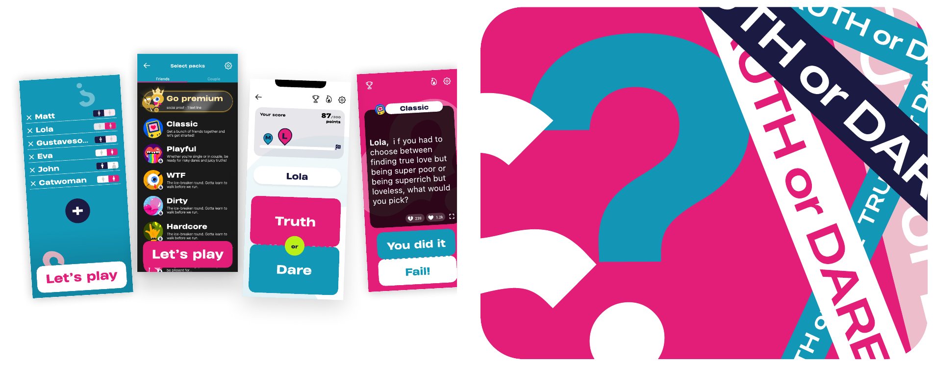
Our main goal for this redesign was to modernize the app’s visual identity and interface.
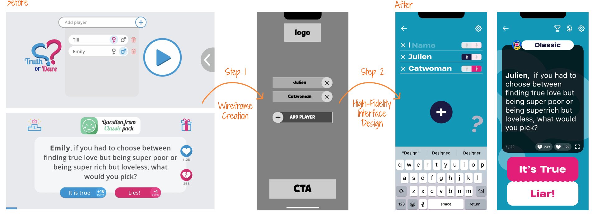
To improve the user experience, we moved from a landscape to a portrait format, making the app more intuitive, more natural to use and better suited to mobile habits.
Another priority was to restructure the interface and the information hierarchy to simplify navigation. The aim was to help users get to what they need faster, while making the experience smoother and more enjoyable.
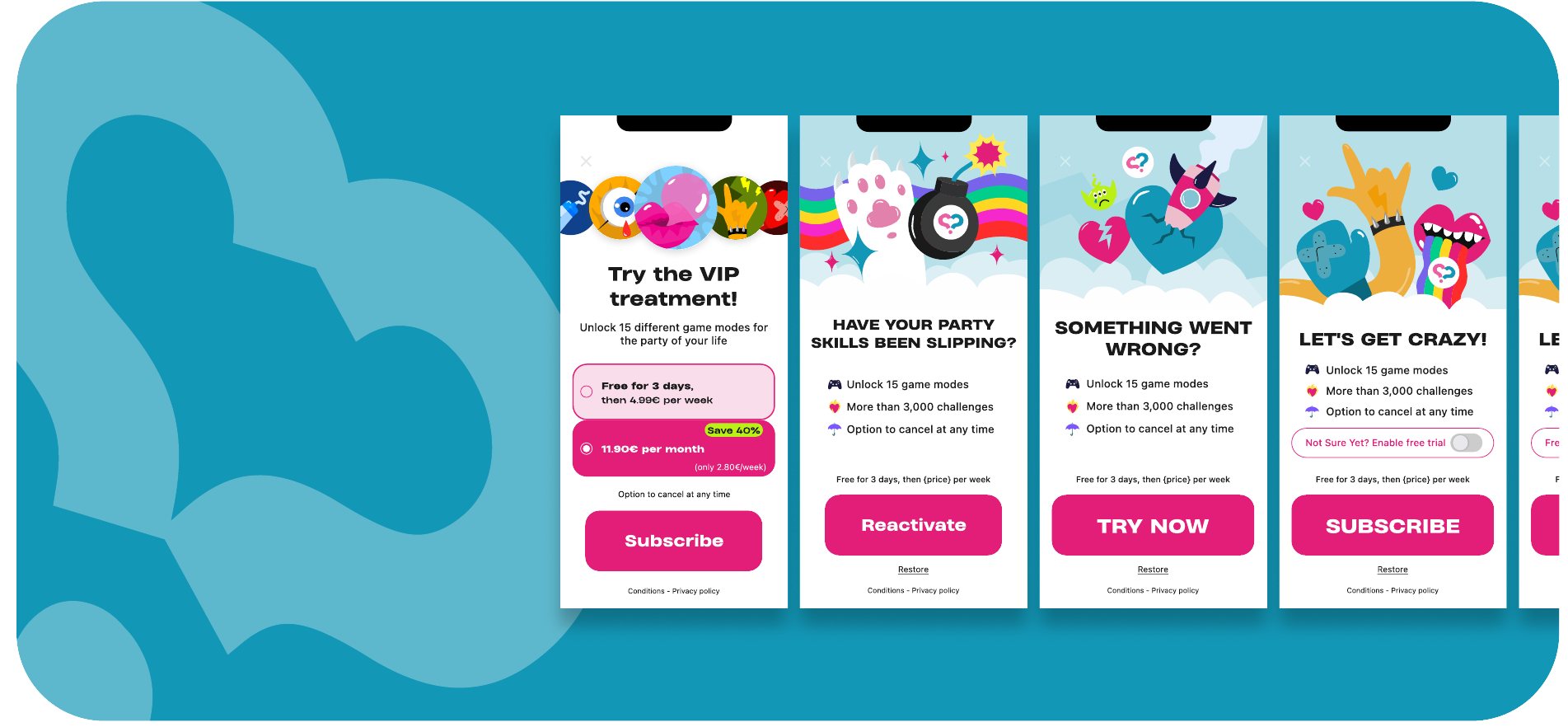
Finally, the redesign also had to improve the app’s business performance. We worked in particular on engagement, calls to action and reducing friction points to optimize the overall experience and conversion opportunities.
Challenges
- Modernize the visual identity while keeping the blue and pink universe, a symbol of complicity, fun and play.
- Design an interface able to adapt to more than 12 languages.
- Reduce drop-off on key screens: player selection, paywall and level selection.
- Improve the user experience by reducing friction and optimizing conversion flows.
Solutions
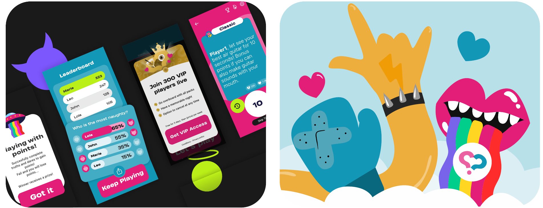
- A new visual identity built on bold typography, saturated colors and a playful, adult, high-contrast graphic universe.
- A typeface compatible with every language, with adaptive text sizing.
- New UX mechanics: autocomplete on the player screen, automatic selection on the level screen and a scoring system to boost engagement during games.
UX/UI design process
The first step of a successful redesign is auditing the existing product.
I started by identifying the interface’s strengths and weaknesses to understand what to keep, improve or remove.
With these foundations in place, I moved on to wireframes and user flow optimization. The work then focused on creating a new, consistent and impactful visual identity. Finally, I refined every detail with animations and micro-interactions to improve engagement, clarity and flow.
Results
The Truth or Dare redesign was a particularly stimulating project, especially since most of the work was done in just three months.
It helped me gain confidence in my branding, illustration and product design skills, while pushing my creative limits and bringing real consistency to the product.
downloads compared to the previous year (Q2).
drop-off on the player selection screen, notably thanks to autocomplete.