
Astrak
Visual identity and UX/UI redesign for an SEO agency’s website.
View the website →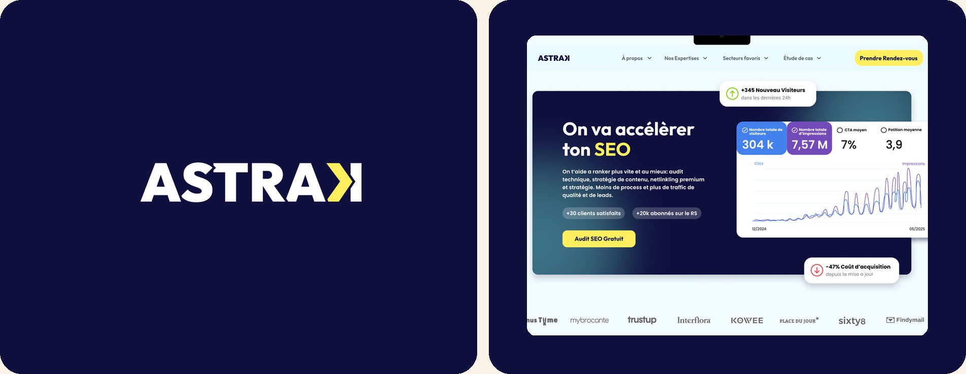
Project goals
Astrak is an SEO agency based in Chiang Mai that steps in when conventional approaches stop working: a tactical, direct, results-driven team. The agency had no visual identity, and its website lacked consistency (CTAs, page structure, text hierarchy). It gave the impression of an agency just starting out and improvising.
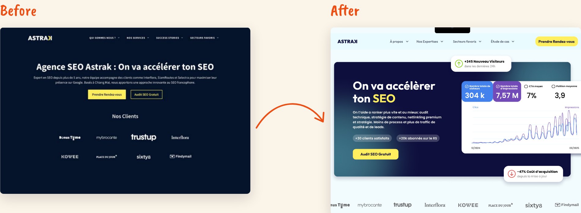
The project had two phases: first, create a modern, unique and memorable identity that conveys strategy, speed and precision; then audit and redesign the website to strengthen Astrak’s credibility and build trust. The goal: a brand image able to compete with the big agencies on the market, such as Eskimoz.
Challenges
- Stand out clearly in an often bland market while avoiding SEO clichés (Excel arrows, rising curves).
- A website with a single user journey, built for visitors who were already convinced (video call booking), and not very accessible to those who just wanted to learn more.
- No design system: each service page seemed designed on its own, with different headers, colors, spacing and CTAs.
Solutions
- Two concepts presented to the client: “Ascension / Tech / Tactics” and “Movement / Instinct / Underwater”. The first one, clearer and better aligned with the market, was chosen: the chevron and the reversed “K” express movement and the will to break the rules.
- A clearer site structure (About, Expertise, Favorite sectors, Case studies) and CTAs made consistent in color, wording and tone.
- A shared design system and page templates (services, case studies, blog) to give the site a clear, repeatable structure: same logic, same rhythm, same style.
Design process
The project started with a detailed brief with the founder: brand values, tone, influences (simplified art deco, modern Japanese graphic design) and what to avoid. I presented two concepts with their keywords, visual references and intentions, along with a comparison to help the client choose.
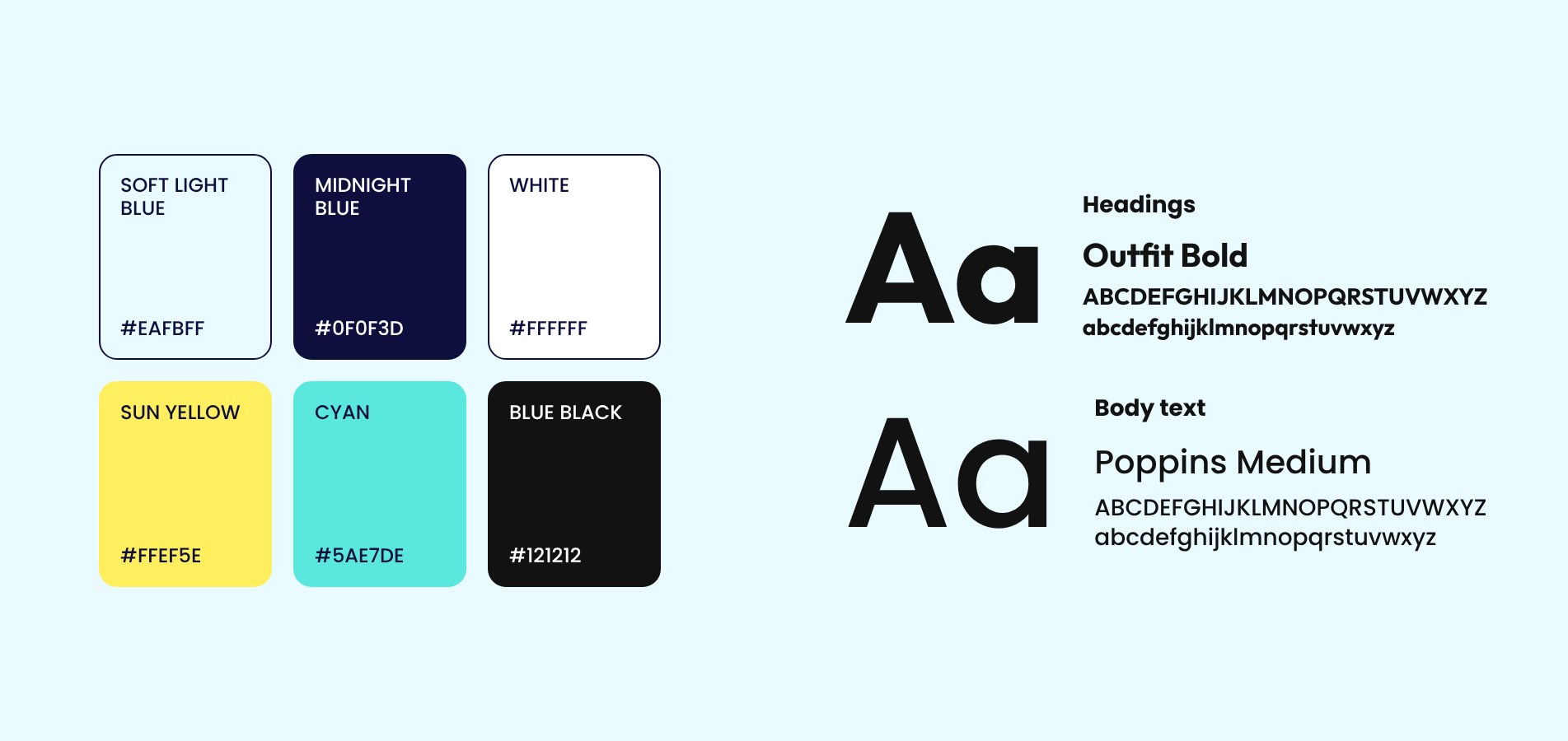
Once the concept was approved, I built out the identity: the logo and its meaning, color palette, typefaces (Outfit Bold and Poppins Medium), icons, logo usage with and without the tagline, and a brand board.
I then ran a three-phase UX/UI audit of the website: scoping and current-state analysis, a page-by-page heuristic audit (home, services, success stories, blog), then a redesign of the key pages (home, blog and blog article) on desktop and mobile. I wrapped up with an action plan prioritized into quick wins, mid-term and long-term steps, so the team could move forward step by step.

Results
The visual identity and the website redesign were fully implemented. The brand guidelines are solid enough that the team now builds new pages with the help of AI while keeping the consistency that makes it a strong brand.
Léo Poitevin, Astrak’s founder and a recognized name in SEO, was very happy and proud to carry his brand. It notably helped him recruit: the agency had two people at the time and now has more than ten.
Visual identity and website redesign fully implemented.
A brand that supported the agency’s growth, from 2 to more than 10 people.
Explore other projects
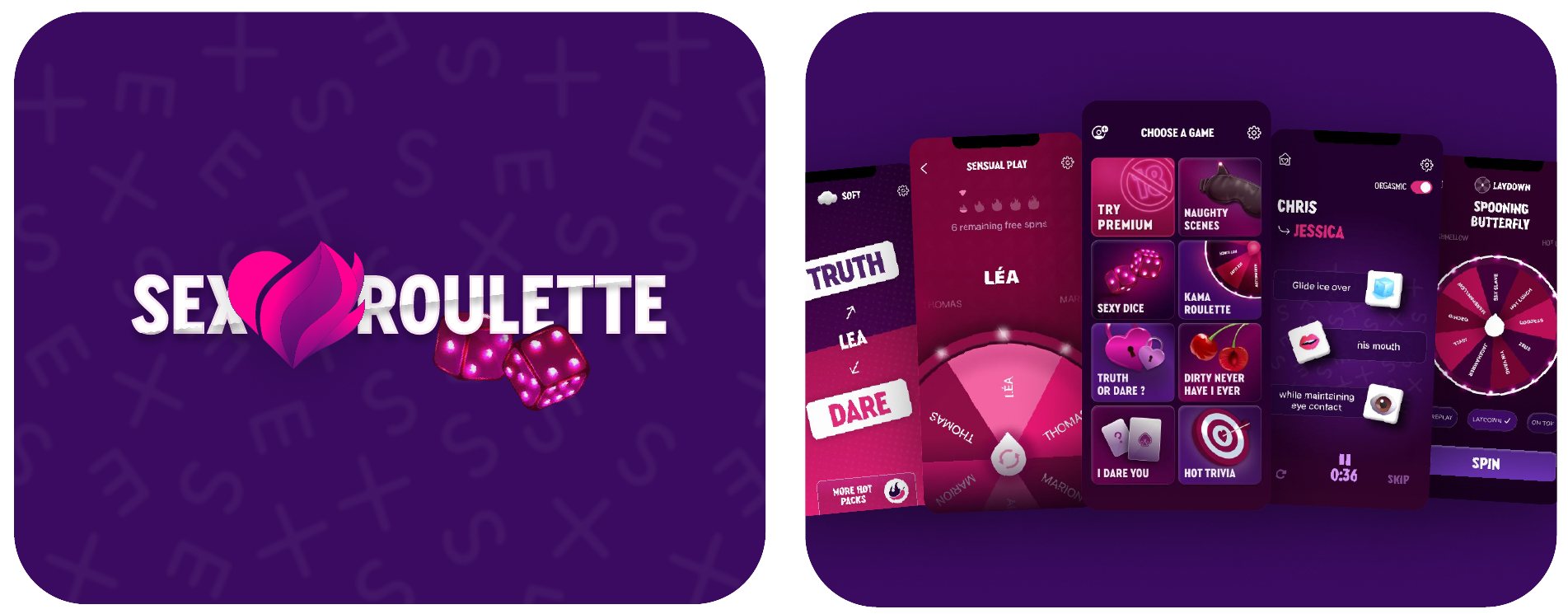
Sex Roulette
Helping couples spice up their love life with sexy games and an immersive user experience.
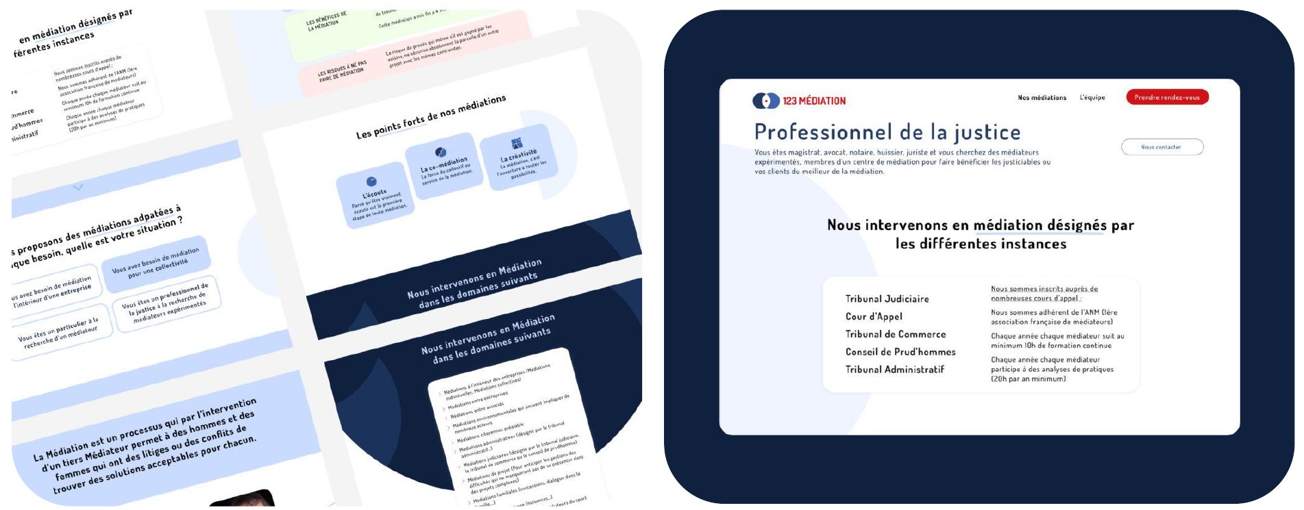
123 Médiation
Designing a simple, accessible mediation service to resolve conflicts effectively and durably.
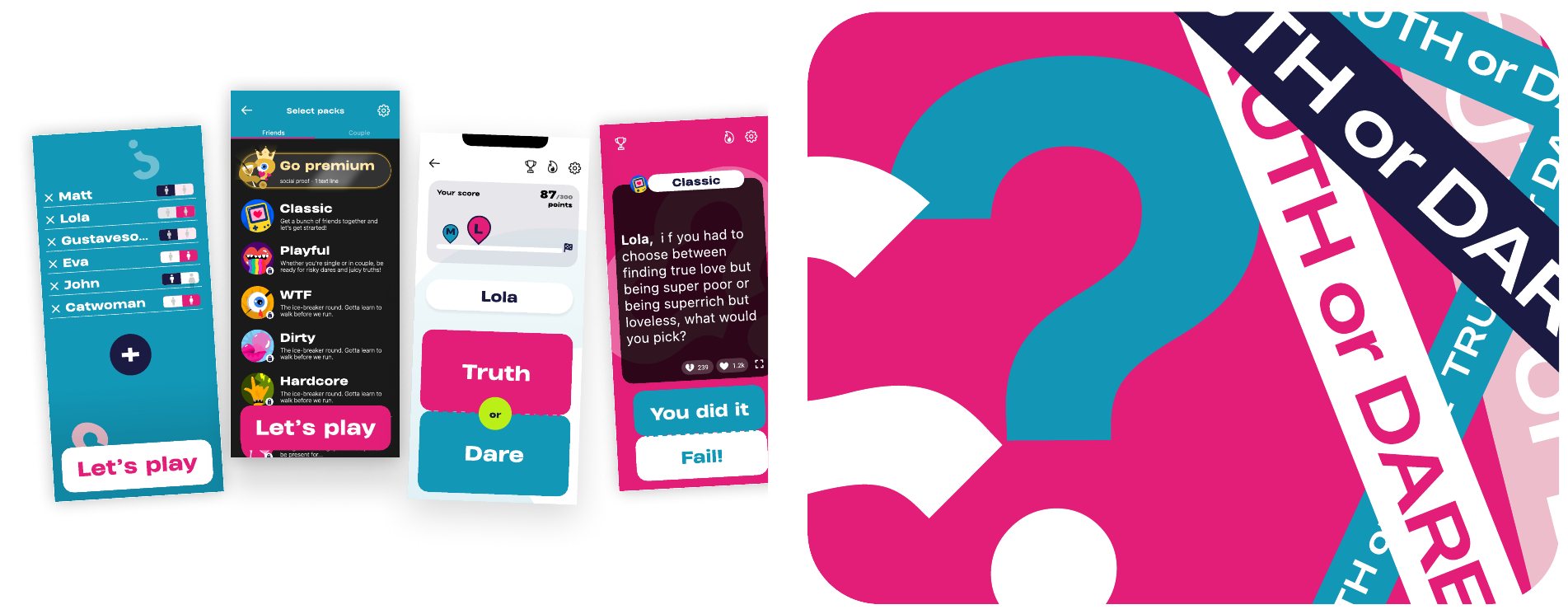
Truth or Dare
Rethinking a party game to create fun, spontaneous and genuine moments between adults.