
Just Us — Couple Games
Helping couples take care of their relationship, with 3 small missions to share every day.
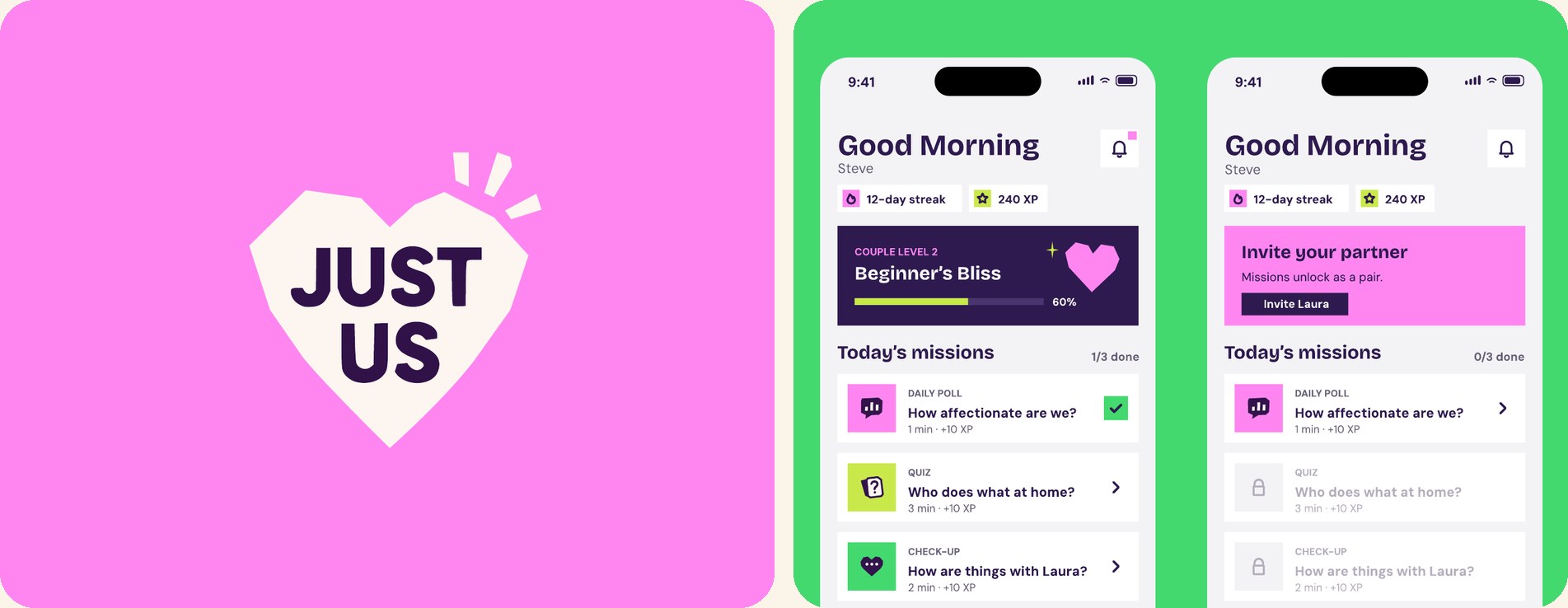
Project goals
Couples who take even 10 minutes a day to share a moment of quality time do better in the long run. Just Us turns this into a routine: every day, the couple gets 3 missions to do together, like writing a sweet note, asking each other questions or checking in on their mood. The app also includes games like “Most likely to…” or “Yes or No” to reconnect while having fun.
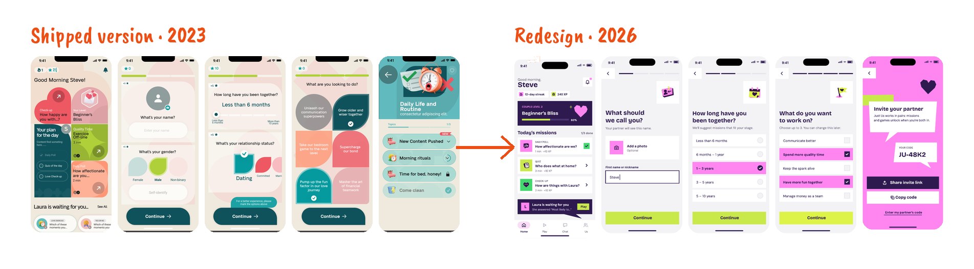
I designed the whole UX structure of the app: research, personas, user flows, gamification strategy and wireframes. The version shipped in 2023 was approved with a very bold art direction. In 2026, I went back to my preliminary work to take the art direction all the way, using AI to speed up iterations.
Challenges
- Build a daily habit for two: the app only works if both partners play along.
- Measure a couple’s progress without reducing it to a score that judges the relationship.
- In the 2023 version, the art direction took over the experience: competing colors, shapes cutting off choices, hard-to-read text.
Solutions
- A two-level gamification system: a shared couple level and individual badges, with XP and streaks designed to encourage without guilt.
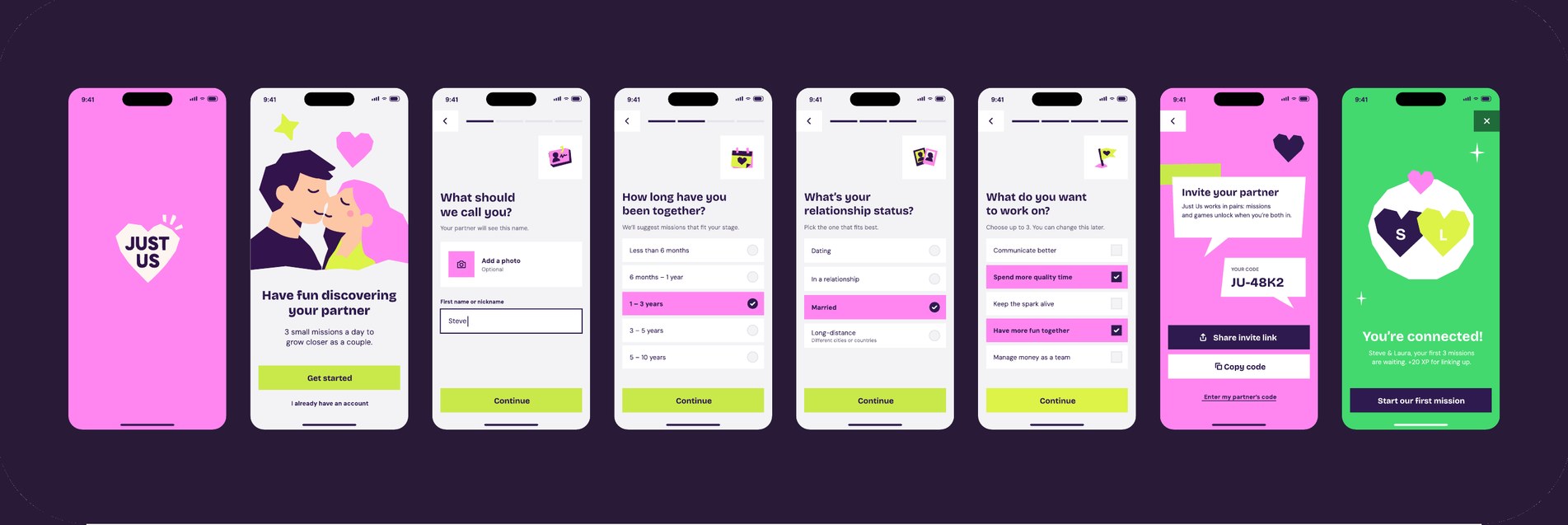
- A simpler onboarding: one question per screen, choices as lists, no more error messages.
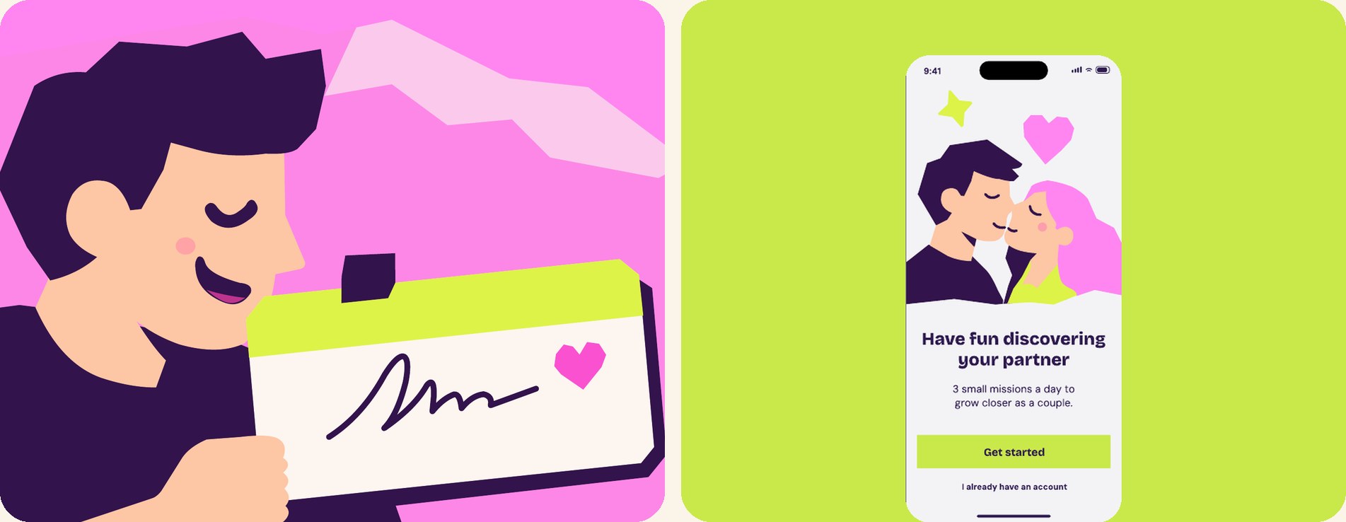
- A new, cleaner art direction that puts the experience first, inspired by the little notes we used to pass as kids: small gestures are what keep a relationship going.
UX/UI design process
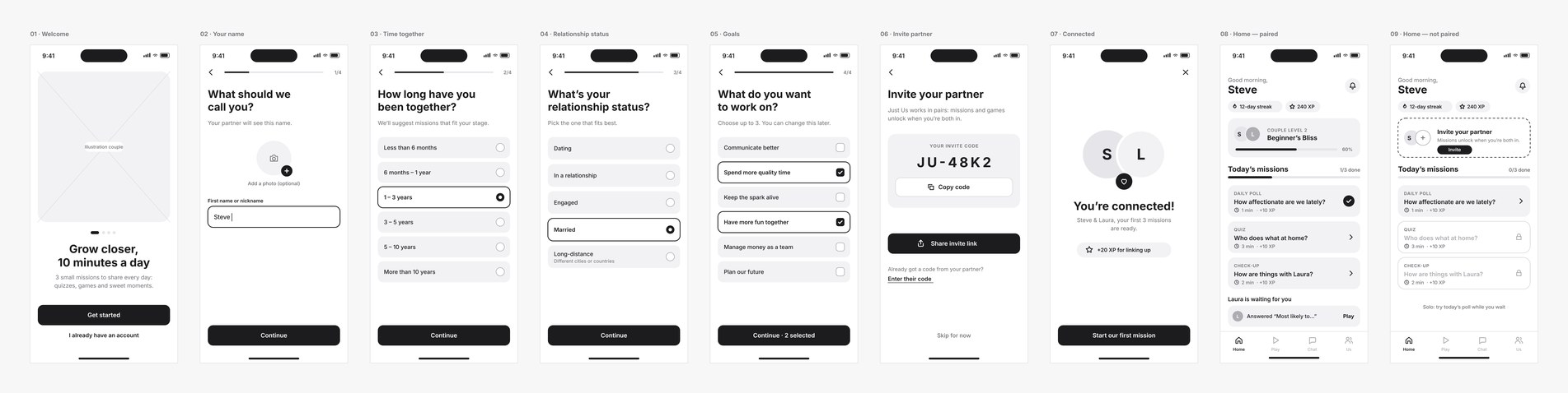
The project started with two personas: Alex and Emily, married for 5 years and short on quality time, and Mark and Sarah, in a long-distance relationship. I then built the gamification strategy around the main motivation drivers (progress, ownership, scarcity, curiosity), and designed and iterated the flow screen by screen.
For the redesign, I built on these foundations and reworked the key screens following onboarding and hierarchy best practices. I explored two art directions, “the link” and “little notes”, before choosing the second. AI (Claude, ChatGPT) helped me produce wireframes, variations and screens in a few days, while I kept control of every UX and visual decision.
Measuring success
Since the app wasn’t relaunched, these are the metrics I would track:
- the share of couples paired after onboarding;
- the number of missions completed per couple per day;
- day-7 and day-30 retention.
Conclusions
I picked this project back up, one close to my heart, as part of my portfolio redesign.
It taught me that a solid UX structure can get lost in an overpowering art direction. Today, I would test the art direction with users before launch, just like the user flows.
Clearer screens and a much clearer user journey.
A redesign done in 1 week with the help of AI, building on existing UX research and an early art direction.